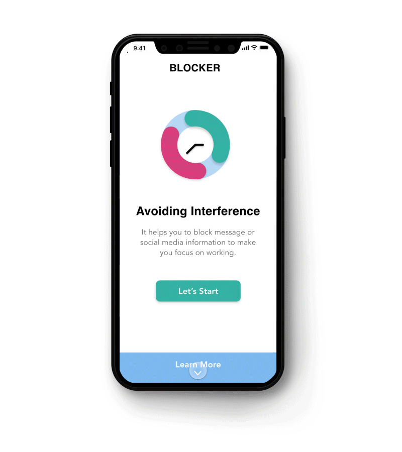
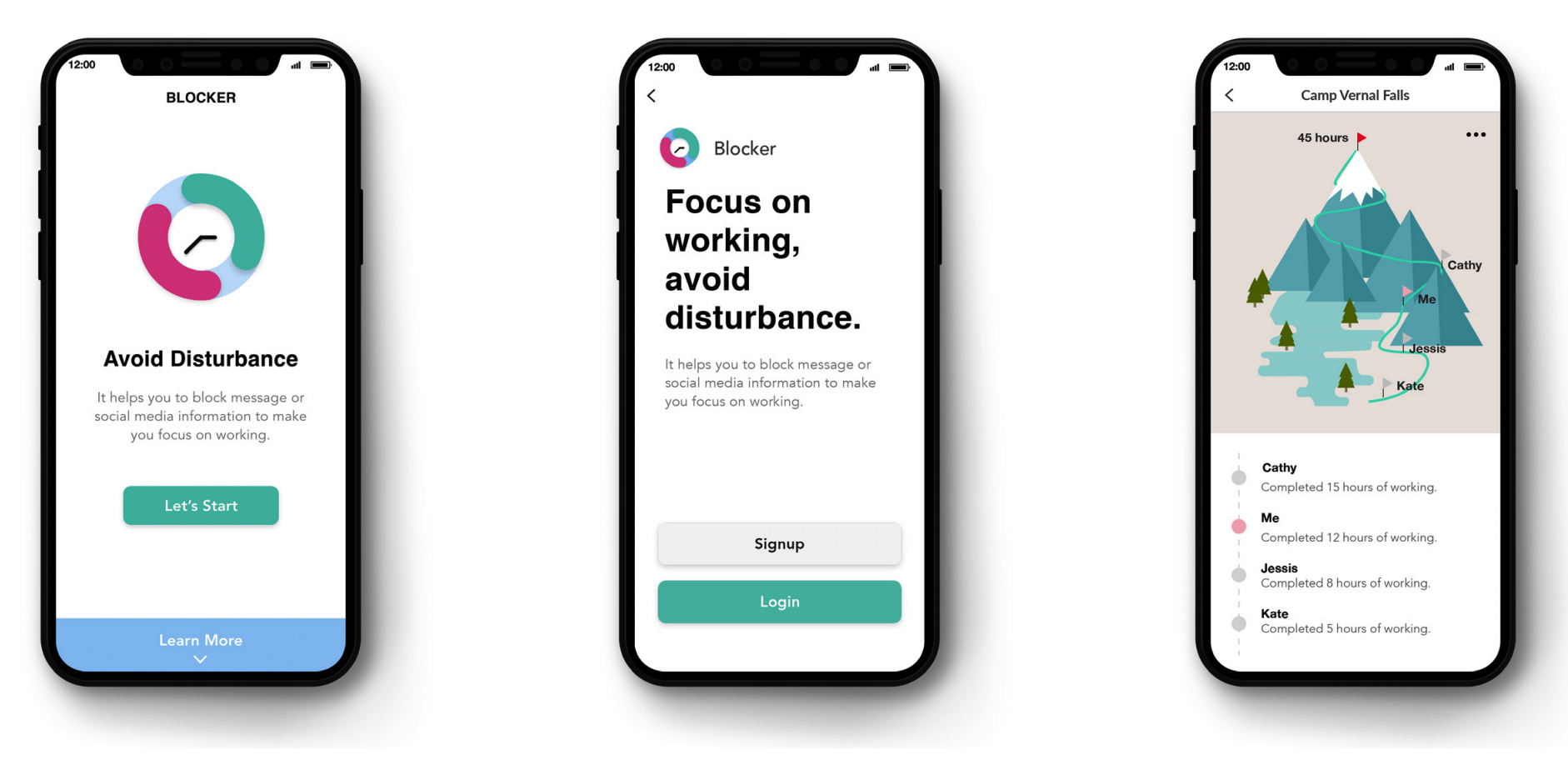
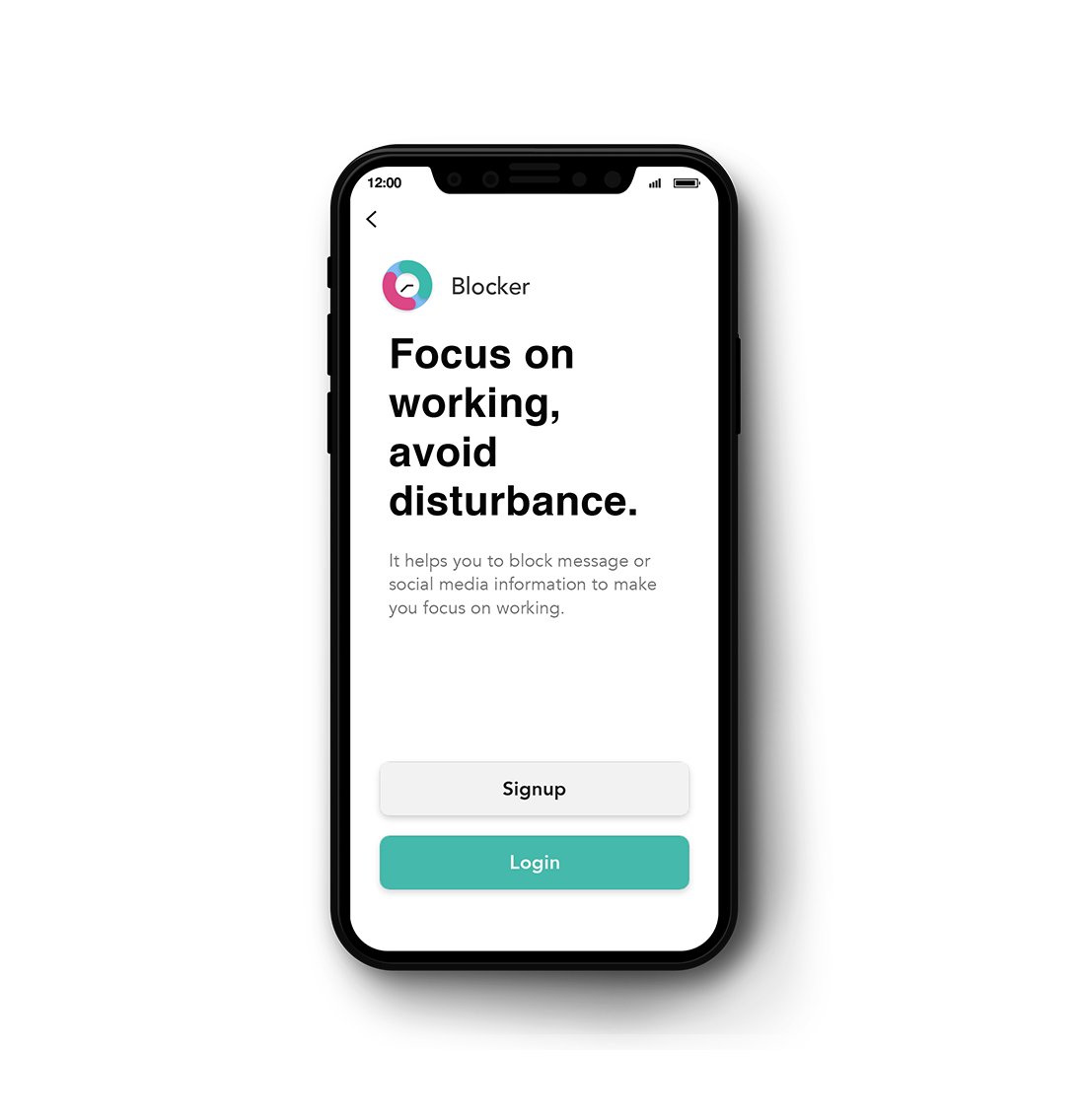
Blocker
FOCUS ON WORKING, AVOID DISTURBANCE.
This is an application which helps people to block message or social media information in order to make the user focus on working or study.
Overview of the Project
More efficient and more motivated time management.
Problem
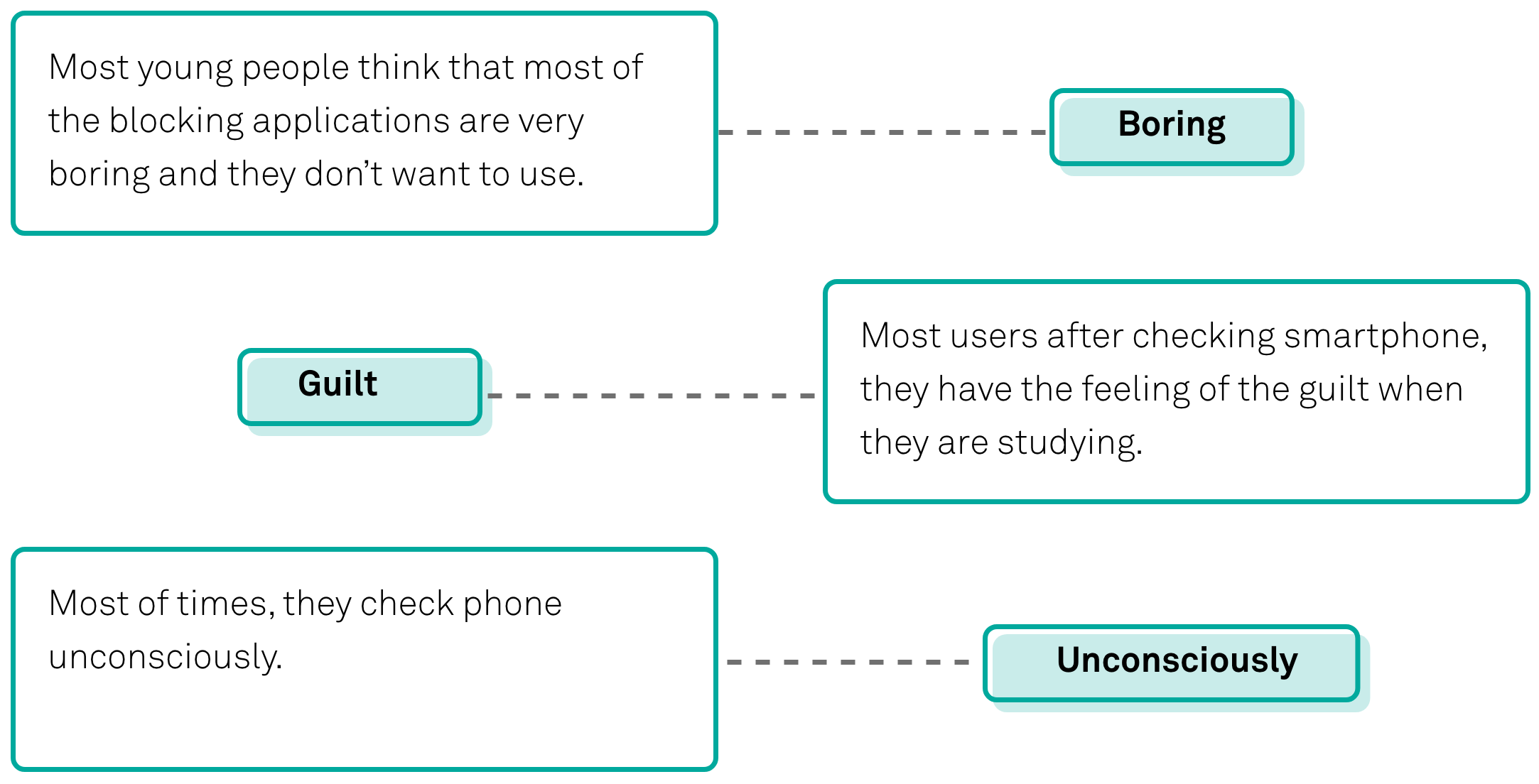
Today, mobile phones have become part of people’s lives, Some people even unconsciously check their smartphone whether or not they have received a message. There are some apps that can help people to solve this problem. But it is not useful for some young students because of their lack of self-control.
Solution
I find that most people check their phones out of habit. Usually, after checking the phone, they realize that they shouldn’t, especially when working or studying. This application focuses on encouraging people using this app to stop checking their phones and make it difficult to get out the app itself.
Interviews and Analysis
Unconsciously checking the phone is the key pain point.
The common thing that I found through contacting and observing the students was that they have an extremely hard time controlling themselves to focus on working . Especially for younger college students who actually live alone for the first time, without their parents. If they are used to checking their phone, it is hard to change the habit.
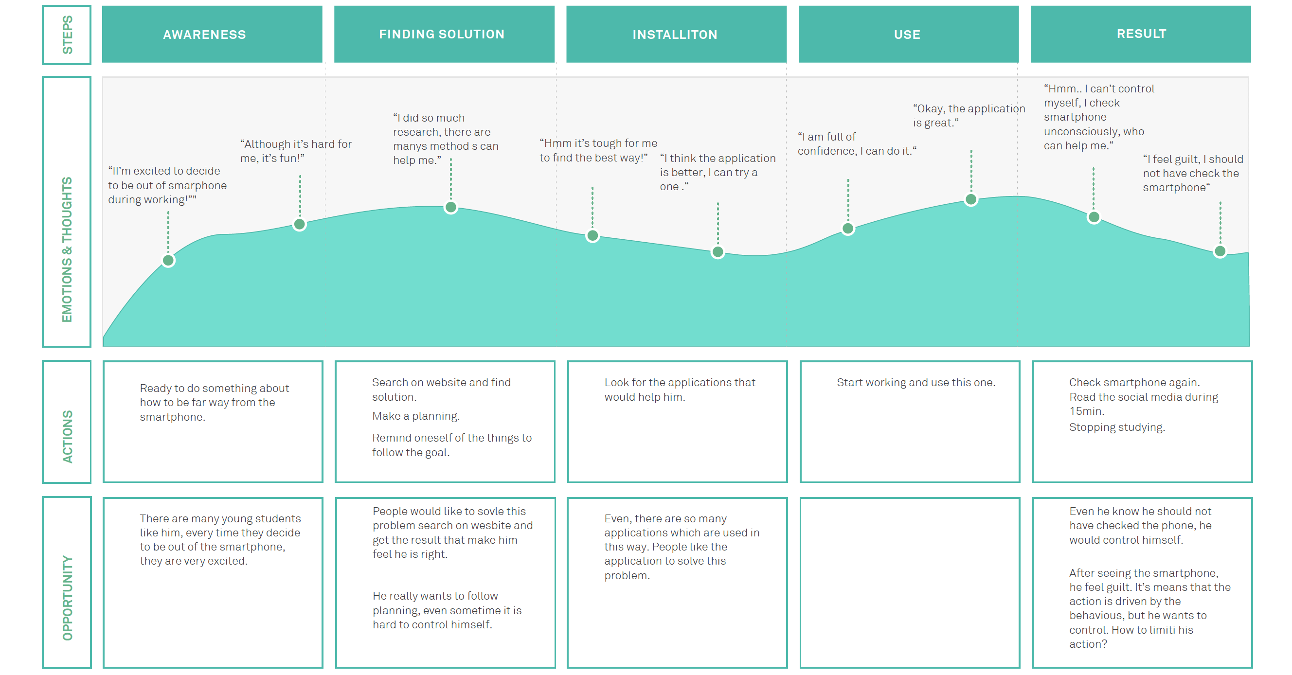
User Journey
Guilt is the first emotion after they check the phone.
I created the user journey which shows a user's feeling of the process of a user who has this problem when he is studying. I find that habits drive some people's action of the checking phone. That means they don't want to watch the phone.
Competitors
No encouragement feature is a problem with all current similar applications, they rely more on the user's self-control.
There are many similar applications today, and they are more or less helpful to my potential users. I analyzed and compared them and found some problems.
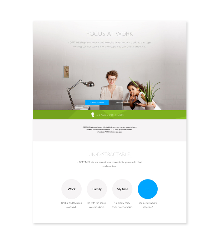
- Offtime
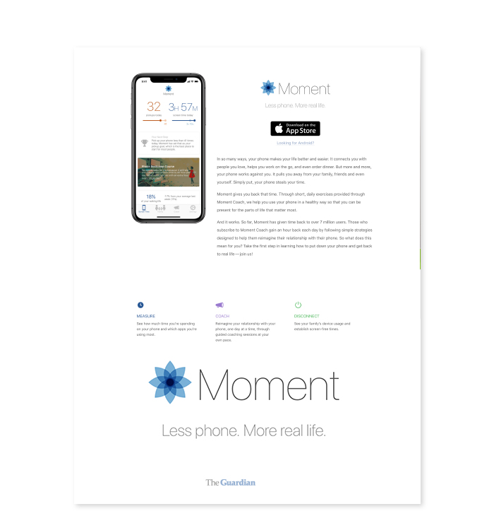
- Moment
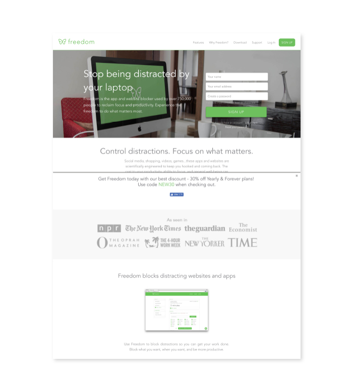
- Freedom
-
Key Features
- This app hones in on mindfuless by allowing you to block what distracts you most: social media, games, and even text messages. You can also break down what you can and can’t access for specific times like Work, Family, or Me Time, making it even easier to separate work and play.
- The interface is not good, and the task flow is not easy to understand. There is no way to encourage the user to continue using it.
-
Key Features
- Moment tracks how much you use your phone or tablet each day, and the results can be alarming. Once you know how much you’re using certain apps, you can set daily limits and get a notification or force yourself to stop procrastinating with a flood of notifications.
- This application provides another way to solve this problem, which shows the usage of eachapplication on the phone. It is good and helpful, but it is not useful for the people who lack self-control.
-
Key Features
- This app works for your phone, tablet, or computer, allowing you to block any distracting websites, apps, or even emails. Freedom uses a VPN to stop these apps from receiving new content and flooding you with notifications.
- This app is the most like the one I want to design. But it still relies the user’s self-control to change the user’s bad habits. Therefore it is not very effective for those who have poor self-control.
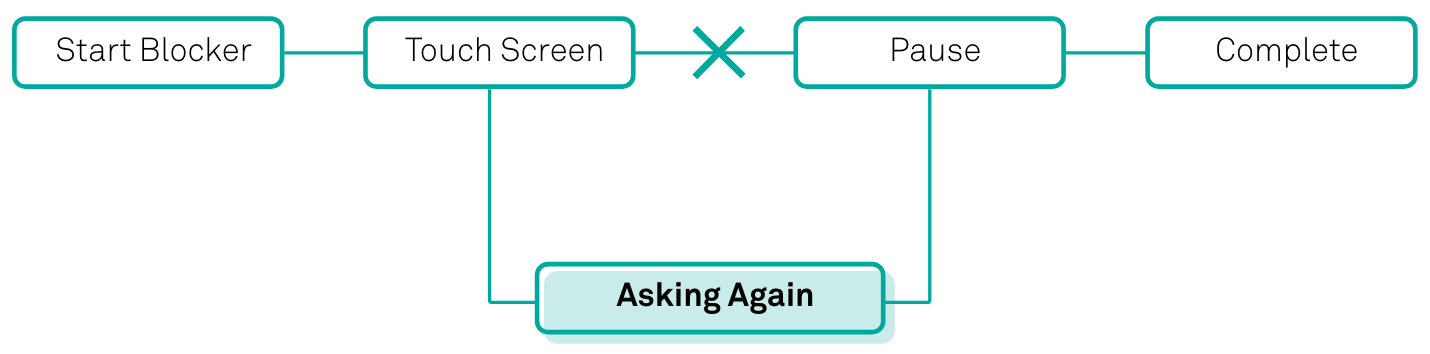
Design Decision
The second asking to make sure if users truly want to go out the app.
Most people feel guilty after checking their phones when they are studying or working. Adding more steps during the process of closing the application will make the user consider if they want to stop the task.
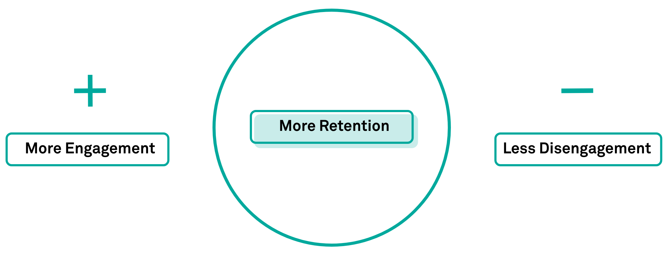
Attracting users as social media application.
I found that most of the users who are loyal to social media are loyal mainly due to communication with friends. So I want to use this factor to attract more users to use my app. I think this aspect is essential because it must be popular enough to draw users' attention. I created the activities on this app and encouraged users to join it. It will increase user usage.
Who it is designed for
"I need a way to help me reduce the negative impact of my phone when I am studying."
Via is a university student. Her major is website and new media design. She is a hard-working student, but she is an addict of social media. Every time she is studying, she can't control herself and unconsciously checks her phone many times, so she needs a way to help her habit. She wants to save time.
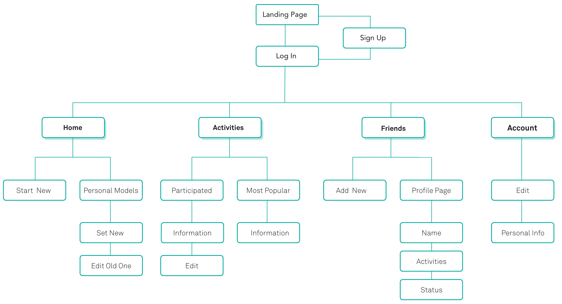
Map Site
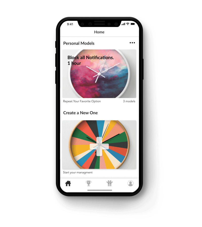
Easily customizable personal models is the soul of productivity applications.
At the very beginning, I considered how to sort the AI map of my app. Combining the analysis and user testing, I made the personal model on the home page at the first level and put the "start new section" after it. These two sections are the main content of my home page. Activities page and Friends page is the second and the third page.
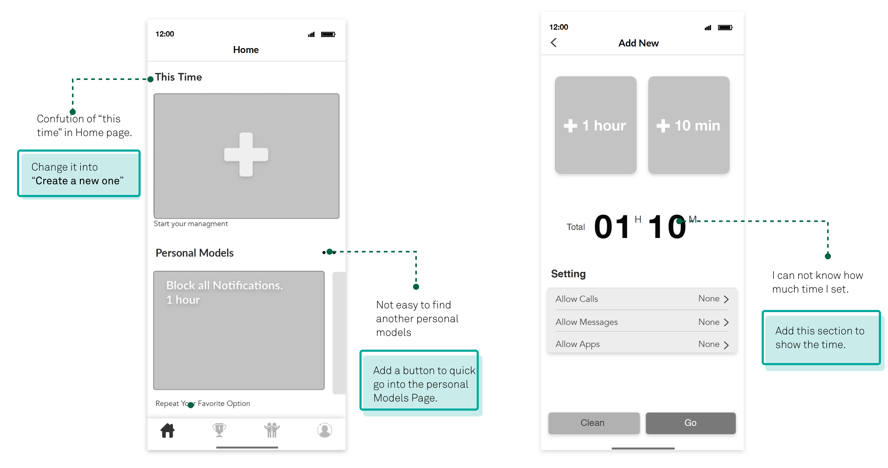
Wireframe
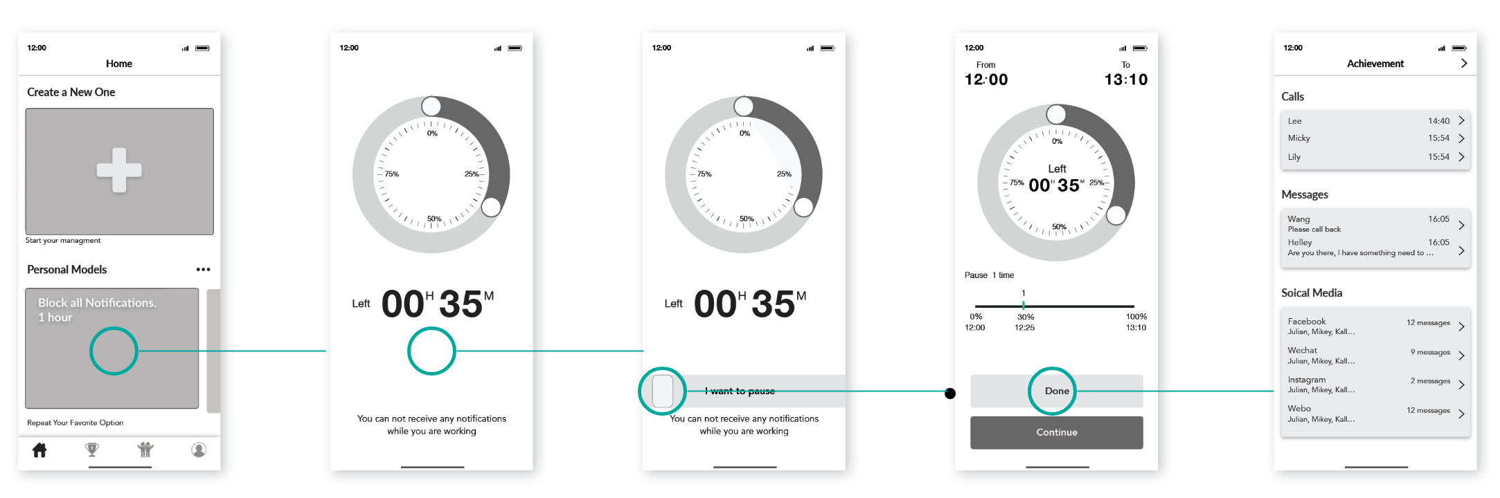
Quickly start a personal model.
According to the user flow, I create the main wireframes of this application. These wireframes show how to start a personal task.
User Testing
Optimizing design start with user testing.
I did several times user testings in order to make sure my design follow the task flows and truly solve the problem.
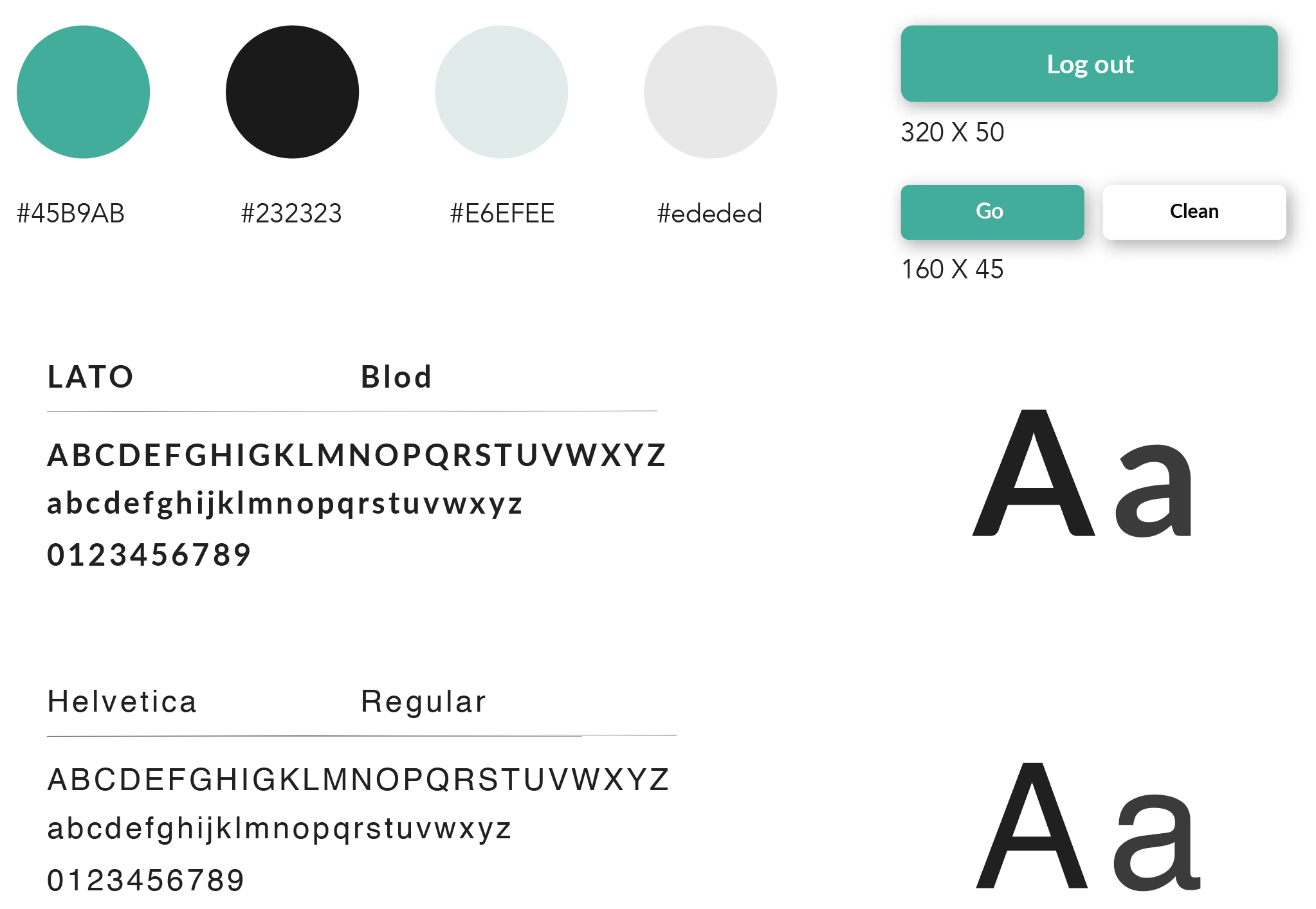
Style Guide
Green is one of the best colors to represent education.
I think my application should be one which looks like a social media application but a little different, so the bold and saturated colors do not fit. I chose green as the main color because it is good for the eye, and sometimes is also a symbol reminiscent of education.
Logo Design
The logo of the shape of the clock makes it easier for the user to recognize it.
This logo is a synthesis of a uppcase ‘o’, the middle letter of a clock, and the shape of a clock. I want that it would convey the meaningful concept which is time is very important. The colorful palette could make it more attractive.